|
Available controls |
|
|
Control guidelines |
Available Controls
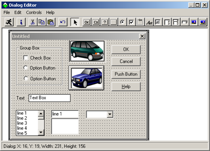
The Dialog Editor supports the following types of standard Windows controls, all of which are illustrated in the above dialog box:
|
Feature |
Description |
|
Check box |
Box that users can check or clear to indicate their preference regarding the alternative specified on the check box label. |
|
Combo box |
Text field with a displayed, scroll list beneath it. Users can either select an item from the list or enter the name of the desired item in the text field. The currently selected item is displayed in the text field. If the item was selected from the scrolling list, it is highlighted there as well. |
|
Drop list box |
Field that displays the currently selected item, followed by a downward-pointing arrow, which users can click to temporarily display a scrolling list of items. Once a user selects an item in the list, the list disappears and the newly selected item displays in the field. |
|
Group box |
Rectangular design element used to enclose a group of related controls. An optional group box label is available to display a title for the controls in the box.. |
|
List box |
Displayed scroll list from which users can select one item. The currently selected item is highlighted on the list. |
|
Picture |
Displays a Windows bitmap or metafile. |
|
Picture button |
Push/Command, button that displays a Windows bitmap or metafile. |
|
Push button |
Command button. Note: Push buttons include:
|
|
Option button |
One of a group of two or more linked buttons that allows users select only one from a group of mutually exclusive choices. Clicking an unselected button in the group selects that button and automatically de-selects the previously selected button in that group. |
|
Text |
Read-only field that contains text the users' information. |
|
Text box |
Field into which users can enter text (potentially, as much as 32K).
|
Control Guidelines
|
General guidelines |
|
|
Tabbing order. |
|
|
Option button grouping. |
|
|
Accelerator keys. |
General guidelines
 A single dialog box can
contain no more than 255 controls
A single dialog box can
contain no more than 255 controls
A dialog box will not
operate properly unless it contains either an OK button, a Cancel button, a push button, or a picture
button.
An OK button and a Cancel button are provided by default on a new dialog box.
Group boxes, text controls,
and pictures are passive elements in a dialog box, inasmuch as they
are used purely for decorative or informative purposes. Users
cannot act upon these controls, and when they tab through the
dialog box, the focus skips over these controls.
A Windows bitmap or
metafile can be obtained from a file or from a specified
library.
Tabbing order
Users can select dialog box controls by tabbing.
The order in which you create the controls is what determines the tabbing order, not the position of the controls in the dialog box.
The closer you can come to creating controls in the order in which you want them to receive the tabbing focus, the fewer tabbing-order adjustments you will have to make later on.
Option button grouping
If you want a series of option buttons to work together as a mutually exclusive group, you must create all the buttons in that group one right after the other, in an unbroken sequence.
If you create a different type of control before you have finished creating all the option buttons in your group, you will split the buttons into two or more separate groups.
Example
You plan to create an option button group with five buttons.
You create in the following order.
Three of the buttons
A list box.
Two buttons
When you test the dialog box, the five buttons will not work together as a mutually exclusive group.
Instead the:
First three buttons will
form one mutually exclusive group.
Last two buttons will form
another mutually exclusive group.
Accelerator keys
You can provide easy access to
A text box, list box, combo
box, or drop list box by assigning an accelerator key to an
associated text control.
The controls in a group box
by assigning an accelerator key to the group box label.
To do this, you must create the text control or group box first, followed immediately by the controls that you want to associate with it. If the controls are not created in the correct order, they will not be associated in your dialog box template and any accelerator key you assign to the text control or group box label will not work properly.
|
|
2. Create a custom dialog box. |