Rectangles have the following general appearance properties.
[Line] Width
The width of the outline for the rectangle (in pixels). You can change the width by clicking the up and down arrows to the right of the field, or by entering another value in this field.
If you make the line more than 1 pixel wide, it needs to be solid.
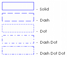
[Line] Style
The outline style of the rectangle. You can choose from the following line styles:
To change the style, choose a style from the menu to the right of this field.
[Line] Color
The outline color of the rectangle.
[Fill] Filled
The Filled check box determines whether the rectangle will be filled with a color.
[Fill] Color
The color with which the rectangle will be filled. The color that you select as your fill color here is static.
To specify a fill color that changes with runtime conditions, click the Fill tab. If you have enabled the Fill (Color) properties, be aware that the color you select here overrides the OFF color for Fill Color (On/Off), the ABC color for Fill Color (Multi-state), Array Color 0 for Fill Color (Array), and the At minimum color for Fill Color (Gradient).
[Object type] Extra line
Adds an extra line (1 pixel width) of lowlight color to the rectangle, if the rectangle is defined as Raised or Lowered (click the 3D Effects tab).
[Gradient] Color
Controls the color of the gradient fill between the fill color and the gradient color. This option is available only when the Filled and Gradient Fill check boxes are selected. The gradient is updated at runtime to reflect the gradient between the two colors selected. Gradient fills support flashing colors.
Gradients do not rotate with an object; for example, if an object contains a left-to-right gradient fill and is rotated 90 degrees (either at runtime or in Graphics Builder), the gradient is still left to right.
[Gradient] Direction
The direction to be used for the gradient color. Use the table below as a guide to choose the gradient color direction you want.
|
Example |
Gradient Color Direction |
|---|---|
|
|
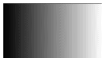
Left to Right |
|
|
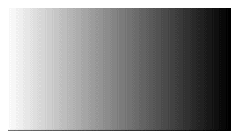
Right to Left |
|
|
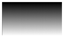
Top to Bottom |
|
|
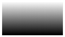
Bottom to Top |
|
|
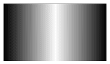
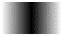
Horizontal Gradient to Middle |
|
|
Horizontal Gradient from Middle |
|
|
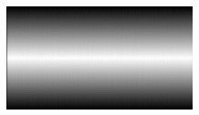
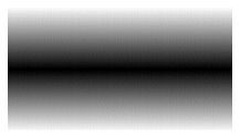
Vertical Gradient to Middle |
|
|
Vertical Gradient from Middle |
[Object type] Border
Adds an extra line (1 pixel width) of black to the perimeter of the rectangle.
[Object type] Corner Radius
Controls the radius of the corners of the rectangle. Enter a value between 0 and 32. The higher the value, the more rounded the corners of the rectangle.
When the radius is greater than 0, the Extra line and Border options are not available.
For help on the remaining properties tabs, see Defining Common Object Properties.