XBar-R chart properties | Configuring an XBar-R chart | XBar-R chart calculations
The XBar-R chart displays two charts: a control chart for subgroup means (XBar chart) and a control chart for subgroup ranges (Range chart) that are drawn in the same graph window in the upper and lower halves of the screen respectively. This composite chart helps to track both the process level and process variation at the same time, as well as to detect the presence of special causes. For variable subgroups sizes, the XBar-S chart is recommended.
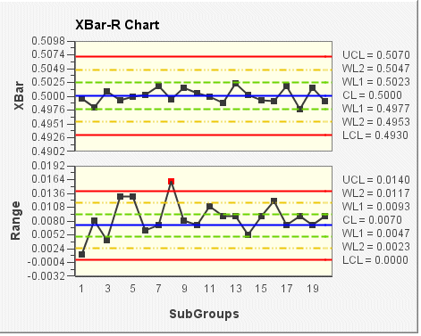
In the following XBar-R chart example, the subgroup size for the sample data is 5 (default size). In the top chart (XBar), the mean (average) of each subgroup is plotted. In the bottom chart (Range), the range of each subgroup is plotted. The control limits (shown on the chart as UCL, CL, LCL, WL1, and WL2) are set according to the VisualSPC data source.