XBar chart properties | Configuring an XBar chart | XBar chart calculations
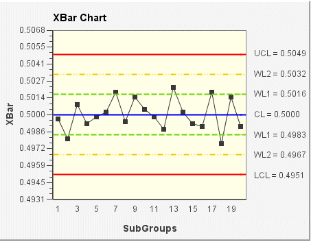
The Xbar chart shows how the mean (or average) changes over time. This chart is used to analyze central location; that is, the center of a set of sample data. The statistic used to describe the central location is the mean.
Data for the Xbar chart can be derived from subgroups of constant size or variable sizes.
In the following XBar chart example, the subgroup size for the sample data is 5 (the default size). The mean (average) of each subgroup is plotted on the chart. The control limits (shown on the chart as UCL, CL, LCL, WL1, and WL2) are set according to the data and a sigma limit of 3.