Histogram chart properties | Configuring a Histogram chart | Histogram chart calculations
A Histogram chart (also referred to as a Normal chart), is a bar graph that shows the distribution of a data set.
The Histogram graphically shows the following:
Center of the data – which is measured by mean, median, and mode.
Spread of the data – how different the values are from the each other and from the middle.
Presence of outliers – outliers are points on a chart that do not fall into the pattern.
Presence of multiple modes in the data – the shape of the histogram may reveal multiple `peaks'.
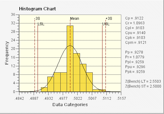
In the following Histogram chart example, each bar represents a sample subgroup. The lower specification limit (LSL) and upper specification limit (USL) lines are shown and labeled accordingly. These values can be set to calculate automatically from a data source, or they can be entered manually in the configuration dialog box. The normal curve is also shown to illustrate the shape of the normal distribution.
On the right side of the Histogram chart, descriptive statistics can be shown. By default, capability statistics (e.g., Cp, Cr) and process capability statistics (e.g., Pp, Pr) are shown on the chart. You have the option of showing other statistics on the chart as well. For a complete list of the available statistics, refer to Descriptive Statistics in the overview section.