Moving XBar chart properties | Configuring a Moving XBar chart | Moving XBar chart calculations
Standard XBar control charts are relatively insensitive to small shifts in the process mean. Control charts based on moving averages are very effective in detecting small process shifts. Moving averages are generally used to smooth out the noise in a time series and forecast future values in a series.
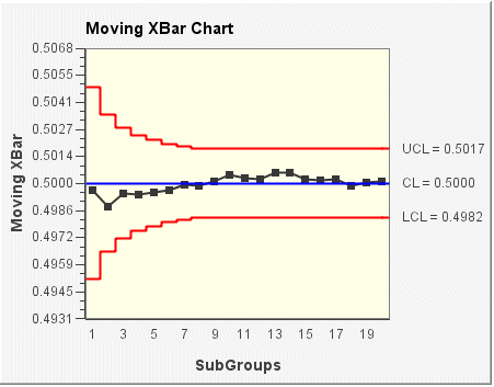
In the following Moving XBar chart example, each plotted point represents a running average of the subgroup. For example, the 2nd point is the average of the first 2 points; the 3rd point is an average of the first 3 points, and so forth. The moving length is the limit for the number of subgroups used to calculate the average. In the following example, the moving average is set at 8, meaning that subgroups are averaged with the 8 consecutive subgroups preceding and including the plotted subgroup. The control limits (LCL and UCL) are also dependent on the moving length setting. In this example, control limits vary for the first 7 subgroups shown. From the 8th subgroup on, the control limits for all subgroups are constant. The center line (CL) is the average of all subgroup averages.