Pareto chart properties | Configuring a Pareto chart | Pareto chart calculations
This chart is used to graphically summarize and display the relative importance of the differences between groups of data. That is, the Pareto chart is used to distinguish significant problems from trivial ones. The bars on the Pareto chart clearly show which groups of data are the most problematic, allowing your business to focus its attention in that area and aim for the greatest magnitude of quality improvement.
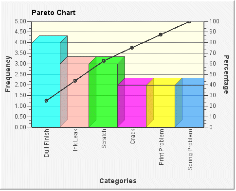
In the following Pareto chart example, each bar represents a segment or category (grouping of data). The vertical axis on the left side of the chart shows the frequency; that is, the number of counts for each category. The bars show the frequency for each category. The Pareto chart always displays the categories in descending order by frequency magnitude. The cumulative percentage (shown on the vertical axis on the right side of the chart) is plotted on the chart. Each bar is shown with its associated cumulative percentage point, and these points are joined to make up the cumulative percentage line.
