Correlation chart properties | Configuring a Correlation chart | Correlation chart calculations
Correlation charts are used to plot linear relationships where there is a correlation between two measures; that is, two measures that tend to vary together. There is not necessarily causation between the two measures. The Correlation chart can be used to improve forecasts based on a strong correlation factor, or to show that two measures do not have a strong correlation factor; that is, they do not vary together.
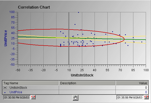
One measure is plotted on the Y axis and the other measure is
plotted on the X axis. The actual data is plotted as a scatter
diagram. The regression line (the line that shows the trend of the
values) is the line in the middle that shows the correlation. A
perfect positive correlation is a 1:1 relationship and has a
correlation value of +1; a perfect 1:1 negative correlation has a
factor of -1. A strong correlation value would typically fall into
the range of 0.85 to 1 (or -0.85 to -1). A correlation value below
0.59 (or
-0.59) indicates a weak correlation.
The lines that frame the regression line are called confidence bands and appear on either side of the regression line. The confidence limit for the bands is configurable. The circular line is called the prediction ellipse and shows a particular confidence variation that you can set on the configuration dialog box.
In the following Correlation chart example, two variables are compared (UnitPrice to UnitsInStock) and are plotted in a scatter diagram. This chart shows the confidence bands (yellow), regression line (green), and prediction ellipse (red).