On each SPC chart configuration panel (on the Data tab), you can set filters so that the data that you want to exclude is removed at run-time. For example, a filter could be set on the data column values so that any value above a certain number is removed, and subsequently all statistics are recalculated.
To filter out bad data, use the bad data options on the Data tab of each SPC chart's configuration panel (as shown in the following diagram).
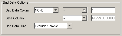
For Quality applications, or any data source that has a quality column, you can set a filter on that column with the Bad Data Column options. For example, your data source's quality column may already mark bad data with a specific value. To exclude the bad data, you can select the quality column (in the Bad Data Column list box) and set the operator and value according to the column value. To exclude the bad data, you can choose the `Exclude Sample' option from the Bad Data Rule list box.
If you are using a ShopFloor SPC data source, bad data is automatically filtered based on the ShopFloor SPC quality column, and the bad data is set to be excluded. You cannot modify bad data options for a ShopFloor SPC source.
NOTE: Bad data filtering is never applied to a null value in the quality column (i.e., regardless of the type of bad data rule that is set, a null value in the quality column is always treated as `good' data).
For Pareto charts, when a single column data source is used, the Quality Column is the only way to filter bad data. This is because the column used has a text data type and the Data Column Value filter accepts only a numeric value.
The Data Column Value operator list box and value box allow you to specify a raw data value that defines the criteria for the filter. The Bad Data Rule list box is where you set the type of filter to use. The options for variable SPC charts are:
NOTE: For attribute SPC charts, the Exclude Sample option is the only type of filter available.
Exclude Sample – the samples that meet the criteria are excluded during run-time. For example, to set a filter that would exclude all samples that are greater than or equal to 0.564, set the Data Column Value operator (>=) and enter 0.564 in the value box. At run-time, all samples that are greater than or equal to 0.564 are removed and the chart is redrawn.
When the exclusion of samples causes sample size to become variable, control limit values will not be the same for all samples. This will cause the control limit lines (if they are set to display on the chart) to appear jagged.
Exclude SubGroup – the subgroups that consist of samples that meet the criteria are excluded during run-time. For example, to set a filter that would exclude all subgroups that contain samples that are greater than or equal to 0.564, set the Data Column Value operator (>=) and enter 0.564 in the value box. At run-time, all subgroups that contain samples that match the criteria are removed and the chart is redrawn.
Use SubGroup Mean – samples that meet the criteria are are removed from a subgroup, and when they are removed, the mean of the remaining samples (in that subgroup) is calculated and used as a substitute for the excluded samples.
After bad data filtering has been applied to an SPC chart, samples that are excluded can cause an entire subgroup to be excluded. The subgroup size must have a minimum of 2 samples, otherwise it will be marked as bad. For example, if the subgroup size is set to 5, and the bad data filtering excludes 3 samples from the subgroup, the subgroup is still used. However, if 4 samples are excluded, the subgroup will be marked as bad, and when you run the chart you will receive an error message.
To see the result of filtering, export the chart data as a Quick Report. How? For variable charts, in the Raw Data section of the report, a Bad Data column indicates, with an asterisk, the samples that have been excluded. For attribute charts, in the Sample Data section of the report, a Bad Data column indicates, with an asterisk, the samples that have been excluded.