During run-time, you can select any plotted point on an SPC chart and exclude the point from analysis. When you exclude a point, control limits and all other statistics are recalculated, the excluded point is not connected to the other points, and it appears in a different color. If alarm rules are used in the chart, they are re-executed.
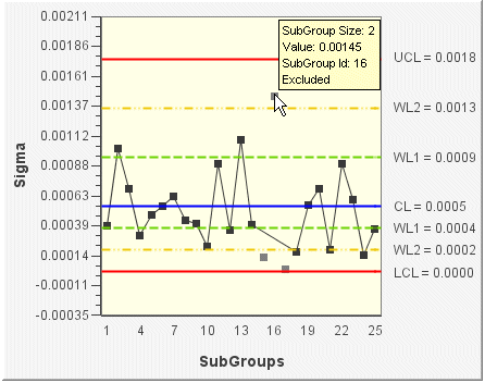
The following example shows an XBar chart during run-time that has two excluded points. The points that have been excluded appear gray. If you are using Tool Tips, the Tool Tip shows that the point is excluded.
On the run-time SPC chart, right-click the data point that you want to exclude. A context menu appears.
On the context menu, select Exclude. Immediately, the point turns gray, the plotted line is redrawn, and statistics are recalculated.
NOTE: If you no longer want an excluded point to be marked as Excluded, right-click the point (during run-time) and select Include from the context menu. The plotted line is redrawn to include the point and the statistics are recalculated.