A summary line can be configured on a Bar chart (if the bar orientation is vertical) and on a Line chart. The purpose of the summary line is to plot a line that represents one of the following:
Average – plots the calculated average of all series items within each category.
Total – plots the calculated sum of all series items within each category.
Maximum – plots the series item with the maximum value within each category.
Minimum – plots the series item with the minimum value within each category.
Rounding of the calculated points is defined in the Tool Tips section of the Configuration dialog box (Chart tab).
The following examples show how summary lines can be used.
Example 1
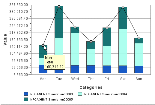
Example 1 is a Bar chart showing stacked bars for three series items in the days of the week categories. The Total summary line is configured to allow the user to quickly find the value for the total of each stacked bar. The Tool Tips for this chart are configured to show the category, series, and value. Rather than displaying the series when the cursor is placed over the Summary point, the type of summary line is shown (in this case, Total).

Example 2
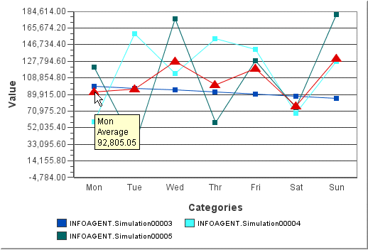
Example 2 is a Line chart that has the same settings for series and category as in Example 1. The type of summary line shown here is Average. The summary line style was changed so that it would stand out more on the chart (the color is changed to red and the marker is a triangle).
