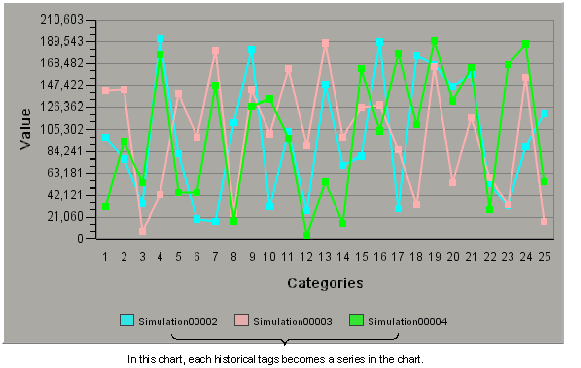
Category charts can be plotted as line charts. A Line chart is similar to a Time chart; it plots values from specific data sources over the x axis. The main difference is that the x axis of a Time chart shows the time span. In a Line chart the x axis shows the selected categories.
In the following example, each line on the chart joins the plotted points of one series (there are three series in total).
