Data in a Category chart can be viewed as a Bar chart. Bar charts plot values as individual horizontal or vertical bars across a chart. Each bar in the chart is defined by a category and a series.
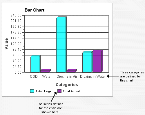
By including both multiple categories and series, Bar charts can show multiple plots for related data. For example, you could define two categories: one for this year and one for last year. Within each category, you could define sales figures for each month, as the following figure shows:
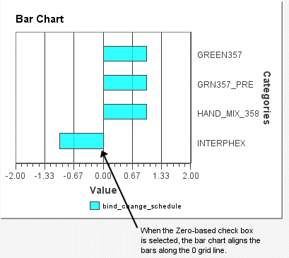
Bar charts can also show negative numbers, as the following figure shows:
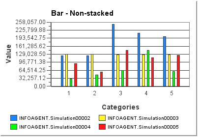
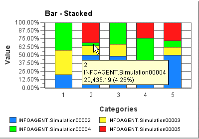
When a bar chart is stacked, all of the bars contained in a category are placed on top of each other. In other words, all series items in a category are shown as one stacked bar. When the cursor is placed over a stacked bar, the Tool Tip can show information about the series item, such as its value and/or percentage (depending on how the Tool Tip is configured). Refer to the following example charts. The first chart shows a typical bar chart with four series items in each of 5 categories. The second chart shows the same data, however, the bars are set to be stacked and are also set to show the series items as percentages. The Tool Tips are configured to show the category, series, and the value. The value's percentage is shown in brackets inside the Tool Tip.
NOTE: You can configure series items to appear as percentages on non-stacked bar charts as well as stacked. The percentage of a series item is based on the ratio of that item to the sum of all other series items in the category. Stacked bars and percentages are supported only for zero-based bar charts.