In category charts, pens are not used. Instead, you determine what is plotted by specifying categories and series. A category is a logical grouping, such as the months of the year, or the types of electronic components you are manufacturing. A series is a measurable value, such as a temperature or the number of components made.
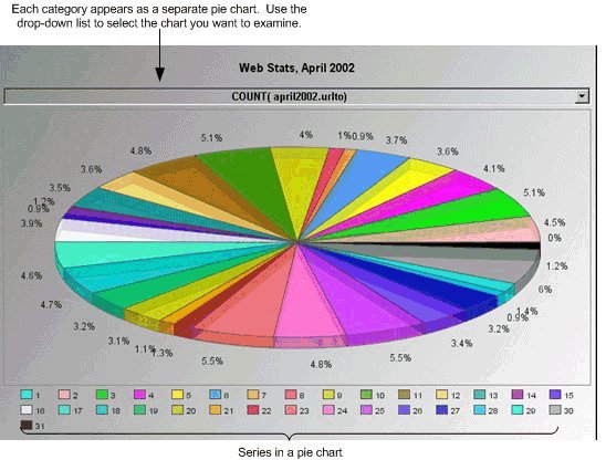
How the category chart uses the categories and series you define depends on the type of data you configure it to display. For example, if you configure the chart to display data as a Pie chart, you define at least one category and one or more series, as the following figure shows:
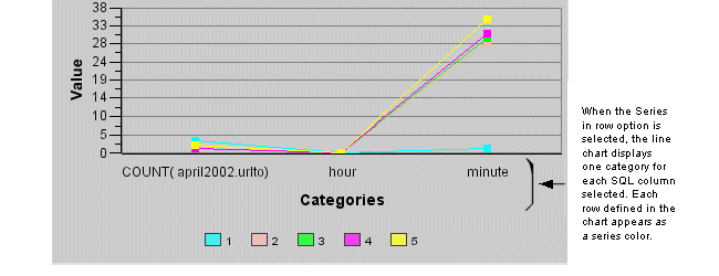
On the other hand, if you are displaying data as a Line chart, define one series for each line you want drawn in the chart and one category for each point in each line. For example the following figure shows the plot of the following data:
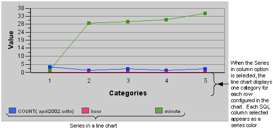
|
count(april2002.urlto) |
hour |
minute |
|
3 |
0 |
1 |
|
1 |
0 |
29 |
|
2 |
0 |
30 |
|
1 |
0 |
31 |
|
2 |
0 |
35 |
If you transpose the rows and columns (select the Series in Columns option on the chart's Configuration panel Data tab) and plot the data, the following line chart results:
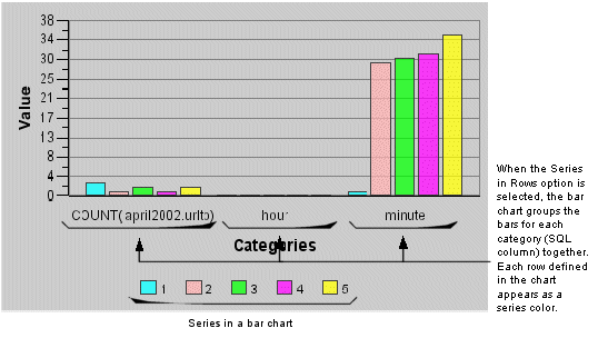
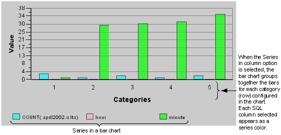
If you configure a category chart to display a bar graph, each series defines a bar and each category defines the number of groups in the chart. The following data and chart serve as an example of category/series usage in a bar graph:
|
count(april2002.urlto) |
hour |
minute |
|
3 |
0 |
1 |
|
1 |
0 |
29 |
|
2 |
0 |
30 |
|
1 |
0 |
31 |
|
2 |
0 |
35 |
If you transpose the rows and columns (select the Series in Columns option on the chart's Configuration panel Data tab) and plot the data, the following chart results:
You can define categories and series in a category chart by selecting a data source. By default, the category is a numbered sequence starting with 1, however, you can redefine the category to one of the following values:
Days of the week.
Months of the year.
A column from the SQL statement you select (when the data source is SQL data).
An historical tag (when the data source is an Historian or OSI PI server).
An iFIX tag (when the data source is an iFIX database).
An OPC item (when the data source is an OPC server).
Likewise, the series in a category chart defaults to be the columns you select from an SQL statement or the historical value you select, depending on the data source you are using. You can swap the series and categories so that the series in the chart uses the rows returned by the data source.