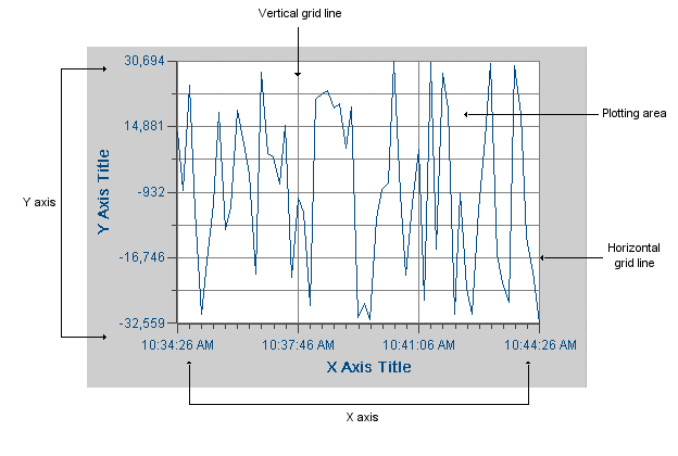
Charts are objects used in Proficy Portal to plot data on a graph. You can use charts to analyze trends over time, compare the trend of one process to another, measure the correlation between variables, categorize data, detect uncontrolled variation in processes, and so forth. The following figure shows the basic elements of most charts.
You can create any of the following types of charts:
Time – plots values over a specified time span. You can plot numeric or string values. Refer to Time Charts for more information.
XY – plots y values for a given x value. The points in the chart show the intersection of data on the x and y axes. You cannot plot string data in XY charts. Refer to XY Charts for more information.
Event – plots values over a specified time span based on pre-defined selection criteria. The criteria defines up to three attributes, such as the lot number or batch ID, and from these attributes the event chart determines the time span. The Event chart is supported for use with Proficy Historian data sources only. Refer to Event Charts for more information.
Category – plots tabular values as a line, bar, or pie graph, depending on your configuration of the chart. During run-time, you can switch the type of chart. For example, if the category chart is displaying data as a line chart, you can switch to a bar graph by selecting the Bar Chart option. Refer to Category Charts for more information.
Variable SPC – plots statistical process control (SPC) analysis charts. Variable type charts are used to analyze data that is derived from measurements such as time, length, temperature, and so forth. The available types are XBar, Range, Sigma, XBar-S, XBar-R, Moving XBar, Moving Range, Individual, and Histogram. Refer to SPC Chart Types for more information.
Attribute SPC – plots SPC charts for specific attributes data. Either the number of defects per group, or the number of defective items is plotted. The available types are Pareto, C, P, NP, and U. Refer to SPC Chart Types for more information.
Correlation – plots linear relationships to analyze the correlation between two measures. The Correlation chart can be used to improve forecasts based on a correlation factor, or to show that two measures do not have a correlation. Refer to SPC Chart Types for more information.
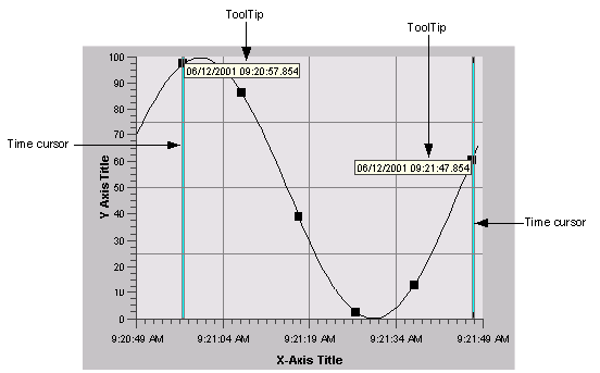
Using a Time, XY, or Event chart's grid and axes, you can determine the values of the data plotted in a trend. However, it is often easier to display the value, date, and time of data points with a time cursor. A time cursor is a vertical bar in the center of the chart that you move left and right by clicking and dragging with the mouse. When you select a time cursor, it changes color and a ToolTip appears. Depending on how you configure it, the ToolTip can show the value, time, and date of each value plotted.
You can configure a Time, XY, or Event chart with one or more time cursors. The following figure shows the time cursors and ToolTips in a Time chart:
Category charts and SPC charts do not show time cursors; however, ToolTips are used in these charts to show specific values, IDs, categories, and so forth. You can configure ToolTips to show only certain items. During run-time, when your mouse cursor moves over a point on a chart, the ToolTip appears.
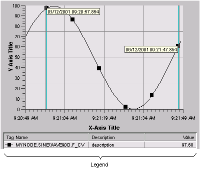
In addition to displaying ToolTips, the time cursor also updates a Time, XY, or Event chart's legend. The legend is a small table that appears at the bottom of the chart, as shown in the following figure.
In a category or SPC chart, the legend displays the series or sample names plotted on the chart. There are a number of configurable options for legends, such as the placement of the legend, what to display, font size, decimal points, and style options.