The Button object
On the Graphics
tab, in the Active Objects group,
click Button to create
custom-sized buttons, as follows:
- Click in the drawing area and drag the mouse/cursor to create the button shape.
- Release the mouse button when the button is the size you want.
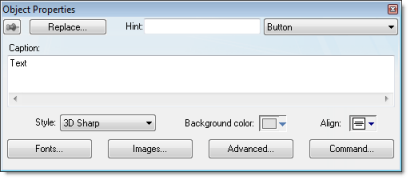
- Double-click on the object to view the Object Properties dialog.
Figure 1. Object Properties: Button

Use the Object
Properties dialog to specify the following parameters for
the button:
- Caption: Specify a caption by typing the text into the text box. You can include a tag by enclosing it in curly brackets (e.g., {tagname}).
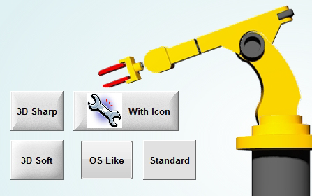
- Style: Select a
style for the button:
- 3D Sharp: A raised, rounded button with somewhat sharpened corners, suitable for touchscreen displays.
- 3D Soft: A raised, rounded button with softened corners, suitable for touchscreen displays.
- OS Like: A button styled to match the operating system on which the project client is running, suitable for Windows desktops running the Web Thin Client or Secure Viewer.
- Standard: The standard, flat button from the previous versions of IWS.
Figure 2. Examples of button styles

- Background color: Select a background color for the button.
- Align: Select the alignment for the caption of the button.
- Fonts: Specify a
font style for the caption by clicking the Fonts.
When the Fonts dialog is displayed, specify the following parameters:
- Font (typeface)
- Font style
- Size
- Effects
- Color
- Script style
- Images: Insert an
image file into the button button by clicking the Images button.
When the Images dialog is displayed, specify the following parameters:
- File: Type the file path to the image file. You can also click the browse button to the right of the box, to open a standard Windows file browser.
- By default, the image is automatically resized to fit the button. To change this, in the Size list, select Custom, and then configure the desired Width and Height (in pixels) of the image.
- Alignment: Select which side of the button that the image should be aligned with.
- Gap: Specify the gap (in pixels) between the image and the side of the button.
- Transparent Color: Select which color in the image should be transparent. The background color (see above) will show through these areas.
- Advanced: Specify
advanced settings for the button by clicking the Advanced button.
When the Advanced dialog is displayed, specify the following parameters:
- Enable translation (optional): Specify an external translation file for the button label by clicking (checking) the box.
- Multiline: Allow the caption of the button to be shown in more than one line, when checked.
- Wrap Text: When checked, the object automatically wraps the text when necessary.
- Auto gray out: Turns the caption of the button to gray when the Command animation applied to the button is disabled by the Disable field or due to the Security System.
- Auto Format: When checked, if the caption includes a decimal value enclosed by curly brackets (e,g, {1.2345}) or a tag of Real type (see Caption above), then the value will be formatted according to the virtual table created by the SetDecimalPoints() function.
- Command: Click to automatically apply a Command animation to the button and then switch to the animation's properties.