On the Graphics tab, in the Active Objects group, click Pushbutton to create a Pushbutton object using the Command animation with an object or pre-configured pushbuttons.
- Momentary (default): Changes state (Open or Closed) when you press the button and reverts to its initial state when you release the button. This button type always displays in its normal position when you open the screen.
- Maintained: Changes state (Open or Closed) when you press the button but does not revert to its initial state when you release the button. You must press the button again to change its present state. This button type maintains its state across screen changes.
- Latched: Changes state (Open or Closed) when you press the button and remains in this state until you release it by changing the Reset tag.
- Rectangular with a faceplate and indicator light
- Rectangular without a faceplate or indicator light (default)
- Rectangular with a 3-D
- Rectangular with a floating appearance
- Click the Pushbutton tool, and position the mouse (pointer) on the screen.
- Click and drag to create/adjust the size of the
rectangular button.
The button size and text font characteristics determine how much text you can display and how much area you can touch on a touch screen. You can resize the button and change the font characteristics later to permit longer messages to be shown in a given space.
- Double-click on the object to open the Object Properties dialog.
Tip: Alternatively, you can right-click on the pushbutton object or highlight the object, press Alt+Enter, and select Properties from the resulting shortcut menu to open the Object Properties dialog.
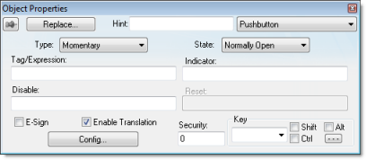
Object Properties: Pushbutton

- Type drop-down list: Click to select the pushbutton type (Momentary (default), Maintained, or Latched).
- State drop-down
list: Click to specify a default state for the pushbutton
(Normally Open (default) or
Normally Closed).
Click the button to toggle between its default and non-default state (according to its specified Type). For example, in the button's initial state, it may conform to characteristics specified in the Open area of the Configuration dialog (see below). Click the button again to toggle to the opposite state, which in this example is Closed, and conform to characteristics specified in the Closed area.
- Tag/Exp text box:
Type a tag or an expression to accomplish the following:
- Type in a tag to receive the Write Value from the appropriate state (Open or Closed) area in the Configuration dialog.
- Type an expression to execute On Down, when you press the pushbutton down.
Note: IWS does not write the result of any expression in the Tag/Exp field into a tag. - Indicator text box: Type a tag to define an indicator that causes the button to change to a specified color when the tag value matches one of two specified values. You must define both the colors and tag values in the Configuration dialog. If you leave this field blank, the indicator changes color automatically when you press the button.
- E-Sign checkbox: When this option is checked, the user will be prompted to enter the Electronic Signature before executing the animation.
- Reset text box
(active for Latched pushbutton
type only): Type a tag to control the button's latched state, as
follows:
- Type a zero and the button will remain in a latched state after you press it.
- Type a nonzero value and a latched button will become unlatched after you press it. You must reset the tag value to zero before you can press the button again.
- Key area: Specify a keyboard key or create a key combination to toggle a pushbutton when you have no pointing device (mouse or touch screen) or if you want to create shortcut keys in addition to pushbuttons.
- Key drop-down
list: Type a key in the text box or select a non-alphanumeric key
from the drop-down list. Enter a single character or key only.
Numbers are not valid entries for this field.
Click (check) the Shift, Ctrl, or Alt box to create a combination key, meaning the Shift, Ctrl, or Alt key must be pressed with the key specified in the drop-down list.
Click the browse button … to open the Key Modifier dialog, which enables you to modify your combination keys. You can choose Left, Right or Left or Right to specify the position on the keyboard of the Shift, Ctrl or Alt key in the combination key. If you choose Left or Right, the command will be executed any time either of these keys is pressed in combination with the key specified in the drop-down list.
- Disable text box: Type a tag using a nonzero value to disable this pushbutton so that pressing the button has no effect. This box is empty by default, which also enables the Command animation.
- Ext Trans. checkbox: Click (check) to translate the text automatically using pre-configured translation worksheets. (See the Translation Tool for more information.)
- Security text box: Type a value to specify a security level (0 to 255) for this button. If the user does not have the specified security level, the button becomes inactive. If the user has the appropriate security level, or you leave this field blank, the button remains active.
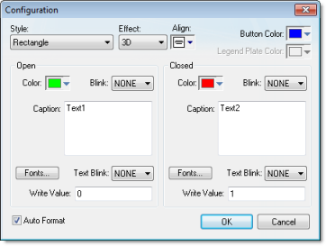
- Config button: Click to open the Configuration dialog, which allows you to specify style and state parameters for the pushbutton:

- Style combo-box: Click the combo-box button to select a pushbutton style (Rectangle (default) or Rectangle with Indicator).
- Effect combo-box:
Click to select a 3-D effect for the pushbutton.
- Floating (default): Buttons resemble a flat object with a shadow
- 3D: Buttons have beveled edges and appear to "depress" into the screen when pressed.
You can use the Style and Effect parameters in combination to create four different buttons, as shown in the following figures:Figure 3. Pushbutton Styles

- Align: Specify the alignment for the caption of the pushbutton.
- Button Color box: Click to specify a default color for the button area of a pushbutton object that includes an indicator and a faceplate. When the Color dialog displays, click on a color to select it, and close the dialog.
- Legend Plate Color
box: Click to specify or change a default color for the legend
plate area of a pushbutton object that includes an indicator. When
the Color dialog displays,
click on a color to select it, and close the dialog.
A legend plate encloses a button and indicator light. This field becomes inactive if the pushbutton Style does not include an indicator.
- Open and
Closed areas: The following
parameters are used to configure the appearance of a pushbutton
object in its open and closed states.
- Color box: Click
to specify a default color for an indicator in each State. When the Color dialog displays, click on a color
to select it, and close the dialog.
If you selected a pushbutton style that does not include an indicator, you can use this field to specify a button color for each State.
- Blink combo-box:
Click to specify whether the color you specified in the
Color box blinks and how fast it
blinks for each state (None (no
blinking, default), Slow, and Fast).
If you set the color to blink, it alternates between the color specified in the Color box and the Legend Plate Color (if an indicator) or the Button Color (if a button).
- Caption text box: Use this text box to enter the caption of the button. Alternatively, if the button style includes an indicator, the legend plate. You can include a tag by enclosing it in curly brackets (e.g., {tagname}).
- Fonts button: Click to open the Font dialog, which you can use to specify or change the message font characteristics for each state.
- Text Blink combo-box: Click to specify whether the text you specified blinks and how fast it blinks for each state (None (no blinking, default), Slow, and Fast). Unlike a blinking color, blinking text appears and disappears.
- Write Value combo-box: Click to select a value in either field. When the pushbutton is in the appropriate state (Open or Closed), IWS writes this value to the tag specified in the Tag/Exp field (Object Properties dialog).
- Color box: Click
to specify a default color for an indicator in each State. When the Color dialog displays, click on a color
to select it, and close the dialog.
- Auto Format: When checked, if the caption includes a decimal value enclosed by curly brackets (e,g, {1.2345}) or a tag of Real type (see Caption above), then the value will be formatted according to the virtual table created by the SetDecimalPoints() function.