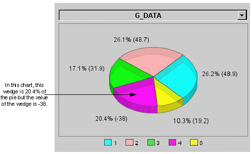
Category charts can plot Pie charts. Pie charts represent each series defined as a slice or wedge of the pie. Associated with each wedge is a value and a percentage. The percentage represents the size of the wedge in the pie. For example, if the percentage is 25%, then the wedge is one quarter of the entire pie.
The values associated with wedges can include negative numbers. When a negative value is provided as a data source, the Pie chart uses the absolute value of the incoming value to calculate that wedge's percentage.