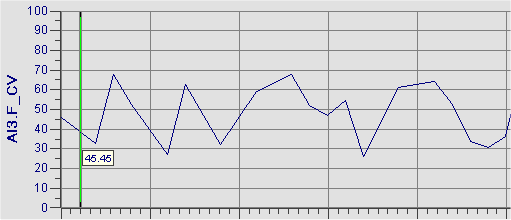
You can control the high and low values on the y-axis of a Time, Event, or XY chart by completing the High Limit and Low Limit fields. For example, if you set the high limit to 70 and the low limit to 50, the chart displays the data for the configured pens between these limits, as the following figure shows:
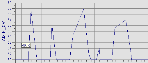
Changing the high and low limits on a chart allows you to bring all the data for the pens into the chart display, or to focus on certain ranges of data. If you do not know the high and low limits of each pen in the chart, select either the Auto Limits check box or the Fetch Limits check box. The Auto Limits check box sets the limits on the y-axis to match the minimum and maximum values of the data retrieved, as the following figure shows:
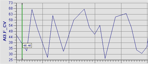
The Fetch Limits check box sets the limits on the y-axis to the limits of the data source, as the following figure shows. In this example, the Engineering Units low and high values for the tag shown in the chart are 0 and 100; therefore, the y axis is set as 0 - 100. The range of the data, however, is 30 to 70. In this case, more detail can be shown in the trend by specifying the high and low limits manually, or by selecting the Auto Limits option.