Charts Properties | Configuring an XY chart
Similar to the Time chart, an XY chart plots y values for a given x value. However, the XY chart does not plot line graphs; it plots the intersection of data on the x and y axes. As a result, the lines drawn in an XY chart are not trend lines. Instead, they are lines that best fit the plotted data.
The XY chart is not meant to be used as a time-based chart (i.e. it does not support the time format). If you use a time pen in an XY chart, the time will be converted to numbers.
By using an XY chart, you gain the flexibility to do comparisons not possible with a Time chart because the x value does not need to be an incrementing or decrementing value. As a result, you can compare any two variables, such as temperature versus pressure. The first data source you specify is always the x axis. All other data sources are treated as y axis values, allowing you to compare multiple y values against the same x axis.
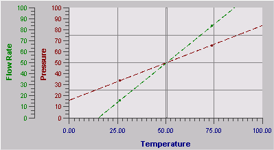
For example, if you want to compare temperature to pressure and flow rate data sources, select your temperature value as the x axis and your pressure/flow rate values as the y axes, as shown in the following figure:

NOTE: You cannot use a string data source in an XY chart.