Click one of the following for information on Enterprise Edition sample displays:
|
Enterprise Main |
|
|
BatchExecution |
|
|
EPAEmissions |
EmissionsHome | EmissionAlerts | EmissionByLocation | EmissionByType | EmissionHeader | EmissionReport | EmissionFooter | XYTrending |
|
Graphics |
|
|
PlantApplications |
ProficyHome | ProductionDownTime | ProductionDownTimeAnalysis | DownTimeReport |
|
Quality |
QualityHome | Summary_Statistics | Defect_Data | ShopFloorSPC | Home (Gage Talker Quality Portal) | Drawing | TimeAnalysis | Descriptive Statistics |
NOTE: If you are having difficulty with the sample displays (e.g., data is not being retrieved), see Using the Sample System.
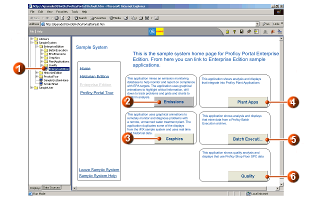
This main Enterprise edition display provides buttons that you can use to access all Enterprise edition sample displays. The categories are described in the following illustration and legend.
|
|
Click here to access the EnterpriseEdition sample display. |
|
|
Click the Emissions button to access six sample displays that work together to form an emission monitoring system for a steel company. |
|
|
Click the Graphics button to access three sample displays that work together to form a remote monitoring and diagnostic system for a water treatment facility. |
|
|
Click the Plant Apps button to access four sample displays that demonstrate how Proficy Portal can integrate into Proficy Plant applications. |
|
|
Click the Batch Execution button to access two sample displays that demonstrate how Proficy Portal can retrieve and display data from a Proficy Batch Execution archive. |
|
|
Click the Quality button to access sample displays that demonstrate how Proficy Portal can retrieve, display, and perform analysis on data from a ShopFloor SPC application. |
The iBatch sample display provides an example of how Proficy Batch Execution data can be viewed in Proficy Portal. Refer to the following illustration and legend for more information.

|
|
Click here to access the iBatchHome sample display. |
|
|
Select a recipe from the Recipe List. The list box is populated by manual entry and is linked (passes a parameter) to four other objects (see #3 and #4). More |
|
|
When you select a recipe from the Recipe List, a text object shows the value that you selected. More |
|
|
When you select a recipe from the Recipe List, these three grids show recipe information. The three grids are configured from the same data source; however, each grid is set up to show different columns. More |
|
|
Select a batch ID from the Batch List. The list box is populated by a data source (batch list), and is linked (passes a parameter) to a text object and the Batch Summary grid. More |
|
|
When you select a batch ID from the Batch List, a text object shows the value that you selected. More |
|
|
When you select a batch ID from the Batch List, the Batch Summary grid shows the batch summary information. |
The iBatchJournal sample display is designed to show how Proficy Portal can imitate Proficy Batch Execution client Journal functionality. Refer to the following illustration and legend for more information.

|
|
Click here to access the iBatchJournal sample display. If
you cannot see the entire display, click the |
|
|
Select a batch journal from the list. The list box is populated by a data source and is linked (passes a parameter) to the grid. More |
|
|
When you select a batch journal, the grid displays the batch information, such as the events for the selected batch. More |
|
|
Click on any column header to sort the information in the grid by that column. More |
|
|
Use the page controls at the bottom of the grid to navigate through the information. There are keystrokes that can be used to navigate grids as well. More |
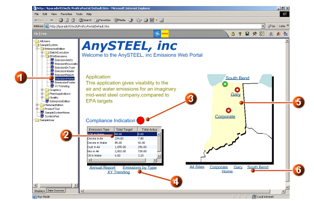
The EmissionsHome sample display is the main display page for the fictional steel company, AnySteel, inc. This display provides summary information, uses graphical animations to highlight critical information, and is the starting point for a number of other displays that work together to form a complete monitoring system. The data is retrieved from an SQL database. Refer to the following illustration and legend for more information.
|
|
Click here to access the EmissionHome sample display. |
|
|
A grid that displays summary information: total target and actual amounts for the emission types. |
|
|
If there are emission alerts, this indicator will flash. To look at the details of the alerts, click the indicator. A pop-up grid shows emission alert details. The pop-up grid is a Thumbnail object. The Thumbnail object does not have an image assigned to it, so that the flashing indicator can be seen `underneath' it. More The flashing indicator is a shape object that is animated. The animation is set so that the indicator is green unless the emission alert count is above a specified number. The animation is also set to blink if it is red. More |
|
|
The links open displays that provide additional detail and analysis. Refer to EmissionReport, EmissionByType, and XYTrending for more information. |
|
|
The map is an inserted image. The circles that indicate locations on the map are animated shapes. These function in a similar way to the compliance indicator (#3), except that they do not blink, and each location uses the emission alert count that is specific to that location. More Beside each location indicator is a link to a display that provides detail on that location's emissions. The links open the same EmissionByLocation display, but the detail returned is for the selected location only. See EmissionByLocation for more information. |
|
|
The links on the bottom of the map launch the EmissionByLocation display where emission details are provided for the chosen site or for all sites. See EmissionByLocation for more information. |
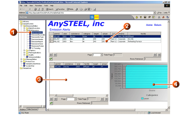
On the main (EmissionHome) display, when you click the compliance indicator, a pop-up grid shows a summary of the out-of-compliance emissions. The EmissionAlerts display provides detail, in a separate display, for these same out-of-compliance emissions records. Refer to the following illustration and legend for more information.
|
|
Click here to access the EmissionAlerts sample display. |
|
|
A grid that shows various details for each emission alert. Click on a specific row to see details in the grid below and in the bar chart. This grid is linked to the bottom grid and the bar chart via the `permit' parameter. More |
|
|
A grid that shows additional detail for a specific row that has been selected in the grid above (indicated as #2). More |
|
|
A bar chart that shows the value of the permit that has been selected in the top grid (indicated as #2). More |
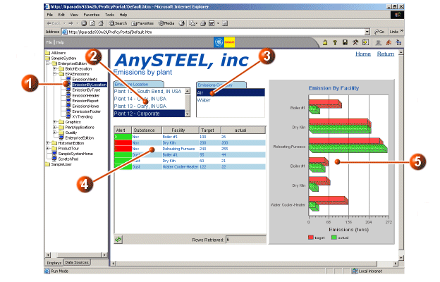
The EmissionByLocation display should be accessed from the EmissionsHome display, via links on or below the map. When a link for a specific location is used, the EmissionByLocation display shows emissions information for that location only. When the All Sites link is accessed, the EmissionByLocation display shows emissions information for all sites. The following illustration and legend show the display accessed from the All Sites link.
|
|
Click here to access the EmissionByLocation sample display from the System Tree. This display can also be accessed from the EmissionsHome display. When the EmissionByLocation display is accessed from the EmissionsHome display, a symbol file is loaded. This symbol file configures the display with the appropriate data source. For example, when the South Bend link is accessed on the EmissionsHome display, the EmissionByLocation display runs the symbol file that loads the source data for the South Bend location. More |
|
|
Click a location in the Emissions Location list box. The grid and chart are updated with location-specific information. This list box is linked to the grid and category chart objects via the LocationName data item. More |
|
|
Click a category in the Emissions Category list box. The grid and chart are updated with the category (and location) specific information. This list box is linked to the grid and category chart via the Category data item. More |
|
|
The grid shows emission summary information for the selected location and category. The Alert column is set up to display as red or green depending on the number of actual units. Threshold values are assigned to the Alert column in the Grid Configuration dialog box. More |
|
|
The bar (category) chart shows emission amounts from each facility for the selected location and category. More |
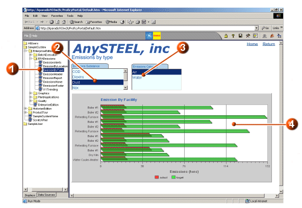
The EmissionByType sample display provides actual and target emission amounts by facility for selected substances and categories. Refer to the following illustration and legend for more information.
|
|
Click here to access the EmissionByType sample display. |
|
|
From the Emissions Substance list box, select a substance. The Bar chart below shows the emissions target and actual amounts for each facility for that specific substance. The list box is linked to the bar chart via the substance item. More |
|
|
From the Emissions Category list box, select a category. The Bar chart below shows the emissions target and actual amounts for each facility for that specific category (and substance). The list box is linked to the bar chart via the category item. More |
|
|
A bar chart that shows, for each facility, the actual and target emissions, depending on the substance and category chosen in the list boxes. More |
The EmissionHeader sample display provides the header that is used by the EmissionReport sample display when printing. Refer to the following illustration and legend for more information.
|
|
Click here to access the EmissionHeader sample display. |
|
|
The header information is a Text object that is configured to display text as well as the Display Description printing function. The Display Description printing option is selected from the Insert Printing Function drop-down list on the Text configuration dialog box. The Display Description text is entered in the configuration dialog box of the display that prints with the header/footer. In this case, the display that will print with this header is the EmissionReport sample display. More |
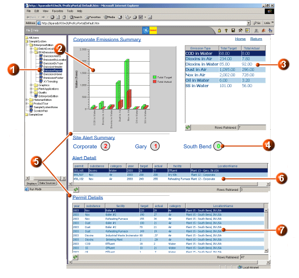
The EmissionReport sample display provides emission details that are set up with printing options such as page breaks, headers/footers, and grid printing options. Refer to the following illustration and legend for more information.
|
|
Click here to access the EmissionReport sample display in the System Tree. |
|
|
A category (Bar) chart that shows the emissions target vs. actual for the emission types. More |
|
|
A grid that shows the same information displayed in the bar chart. More |
|
|
The emission alerts for each site are made up of Text and Shape objects. The alert itself is a text object that has been configured with two types of animations. Foreground animation allows for the color change when there is one or more alert. Caption animation is set to retrieve the number of alerts from a data source. More |
|
|
The gray lines are page breaks that have been inserted into this sample display. You can see the page breaks in Configure mode only (they will not appear in Run mode). When the display is printed or previewed, a new page begins immediately following each page break. More |
|
|
A grid that shows the details associated with the emission alerts. |
|
|
A grid that shows the details associated with each permit record. This grid is configured with the `Vertical Expansion Only' printing option. This means that when the display is printed or previewed as a Report, all records in the grid will be printed or previewed over a number of pages if necessary. More To print or preview the display as a Report, in Run mode, right-click on any blank area of the display, and from the context menu, choose Print (or Print Preview) | Report. You must have Adobe Acrobat Reader (version 6.0 or later) installed on your machine to use the Preview feature. More On the printed Report, you will notice the header and footer appears on each page. The displays that are used as headers and footers are specified in this display's Edit Current Display Settings dialog box (Printing tab). You can access this dialog box in Configure mode (right-click in a blank area of the display and choose Edit Current Display Settings. More |
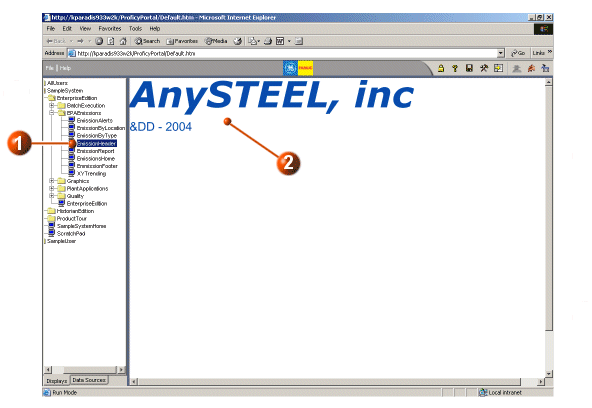
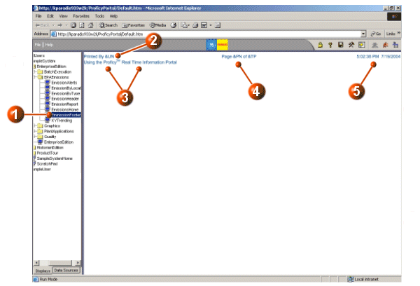
The EmissionFooter sample display provides the footer that is used by the EmissionReport sample display when printing. Refer to the following illustration and legend for more information.
|
|
Click here to access the EmissionFooter sample display. |
|
|
The `Printed By' information is a Text object that is configured to display text as well as the User Name printing function. When the EmissionReport display is printed, the name of the user is shown in place of the `&UN'. More |
|
|
The rest of the text shown here are Text objects. |
|
|
The page information is a Text object that is configured to display text and two printing functions: Page Number and Total Pages. When the EmissionReport display is printed, the page number and total number of pages is shown in the footer of each page. More |
|
|
The time and date information is a Time and Date Link that is configured to show the time, followed by the date. When the EmissionReport display is printed, the current time and date are shown in the footer of each page. More |
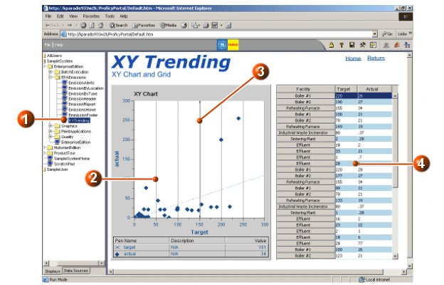
The XYTrending sample display provides an example of how an XY chart can be used to analyze emissions data. Refer to the following illustration and legend for more information.
|
|
Click here to access the XYTrending sample display. |
|
|
An XY chart plots the actual emissions on the y-axis and the target emissions on the x-axis. More |
|
|
Click the cursor and drag it over data points. The values appear in a Tool Tip. More |
|
|
A grid shows the target and actual emissions amounts for each facility. This grid is configured with a vertical Fill Direction and visible row headers, to make better use of the available space. More |
The GraphicsHome sample display is the main display page for a fictional, remote water treatment plant. The three displays that make up the Graphics section are similar to the iFIX Water/Wastewater sample displays. Both real time and historical data is used in the Graphics sample displays. Refer to the following illustration and legend for more information.


|
|
Click here to access the GraphicsHome sample display. If
you cannot see the entire display, click the |
|
|
A Time chart that shows the current temperature in real time. |
|
|
A hyperlink that opens the www.weather.com web site and passes the web site a zip code so that the local weather forecast can be viewed immediately. More |
|
|
An animated shape that indicates the wind direction. The shape is configured with rotation angle animation that retrieves real-time wind direction data from a data source. More Below the wind indicator is a Datalink object that indicates the wind speed. The Datalink retrieves real-time wind speed data from a data source. More |
|
|
A grid that shows quality measurements for each station. More |
|
|
An inserted image that shows the layout of the treatment station. More Click the hyperlinks on this image to open the other Graphics sample displays. Refer to ChemicalFeed and AlarmHistory for more information. |
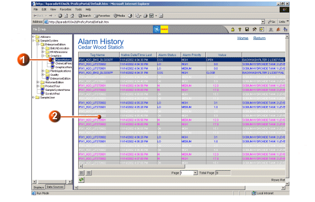
The AlarmHistory display provides an example of how the iFIX alarm connector and iFIX alarm analysis object can be used in Proficy Portal. Refer to the following illustration and legend for more information.
|
|
Click here to access the AlarmHistory sample display in the
System Tree. If you cannot see the entire display, click the
|
|
|
An Alarm Analysis object that retrieves alarms data from the iFIX sample system database. More The Alarm Analysis object is configured as follows:
|
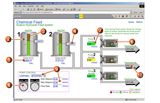
The ChemicalFeed display is duplicated from the iFIX Chemical Feed sample picture. The display shows a sample Sodium Hydroxide (NaOH) chemical addition system. Real-time (iFIX) data, shapes, images, and animations are used to reproduce this iFIX picture in Proficy Portal. Refer to the following illustration and legend for more information.
|
|
Click here to access the ChemicalFeed sample display. If
you cannot see the entire display, click the |
|
|
The tanks, pumps, and their connectors are inserted in the display as one image. More |
|
|
The tank level indicator is an animated rectangle. A threshold table is used on the animation to change the indicator color from green to yellow. More |
|
|
The tanks level reading consists of several shape objects and two text objects that are grouped together. The text object that shows the level is animated with a caption animation. More |
|
|
The volume read-outs are text boxes that retrieve values from the real time data sources. More |
|
|
The pumps have indicators that show the pump status (on-line, off-line, or fail/alarm). The indicator is an animated circle with thresholds set on the foreground color. More When you click on a pump, its associated controls are available at the bottom left in the `Pump Control' section. See #8 for details. |
|
|
The flow rate indicators are text boxes that retrieve values from the real time data sources. More |
|
|
After clicking the pump you want to control (see #6), you can click the auto/man or run/stop controls. Each control is a toggle (e.g., click once to switch from automatic to manual and vice versa). The control is an animated rectangle (set with rotation angle animation). In addition, the rectangles are configured with the Toggle Digital Command. More After you toggle the pump controls to Stop and Manual, an Enter Setpoint button appears to the right of the controls. Press the button and enter the value in the pop-up. The button is configured with the Write Value Command; therefore, the value you enter is written back to the data source. More |
|
|
Text boxes that show pump status, setpoints, and flow rate. The text boxes retrieve data from real time sources. More |
|
|
The destination indicators are text objects that are configured with a caption animation. A threshold table is used to return the appropriate text. More |
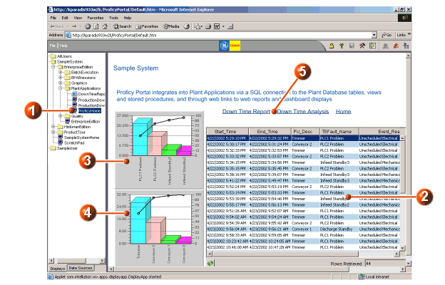
The ProficyHome sample displays show how Proficy Portal can integrate with Proficy Plant applications. Proficy Portal uses SQL to connect with Plant Database tables, views, and stored procedures. The ProficyHome sample display retrieves downtime information and provides fault count analysis.
|
|
Click here to access the ProficyHome sample display. |
|
|
The grid displays downtime detail from the Plant Application sample system. More |
|
|
A Pareto chart that plots the downtime fault counts by problem type. More |
|
|
A Pareto chart that plots the fault counts by location. More |
|
|
Links to other Proficy sample displays. See ProductionDownTime and ProductionDownTimeAnalysis for more information. |
The ProductionDownTime sample display shows how Proficy Plant Applications' downtime data can be accessed in Proficy Portal in a tabular format. Refer to the following illustration and legend for more information.

|
|
Click here to access the ProficyDownTime sample display. |
|
|
From the Select Location combo box, select a location that you want to view downtime data for. The combo box is populated by a data source and linked (passes a parameter) to the grid. More |
|
|
The grid displays downtime detail for the selected location. More |
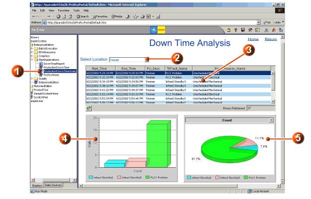
The ProductionDownTimeAnalysis sample display shows how Proficy Plant Applications' downtime data can be accessed in Proficy Portal in a tabular format, and also provides two types of category charts that show fault counts. Refer to the following illustration and legend for more information.
|
|
Click here to access the ProductionDownTimeAnalysis sample display. |
|
|
From the Select Location combo box, select a location that you want to view downtime data for. The combo box is populated by a data source and linked (passes a parameter) to the grid, as well as to the category charts. More |
|
|
The grid displays downtime detail for the selected location. More NOTE: The combo box and grid shown here are the same as the ones in the ProductionDownTime sample display. |
|
|
A bar chart that shows the fault counts. More |
|
|
A pie chart that shows the fault counts as percentages. With a category chart, you can change the type of chart during run time. For example, right-click the charted area of the pie chart and choose Bar chart from the context menu. You will notice that the chart looks the same as the bar chart shown in #4. More |
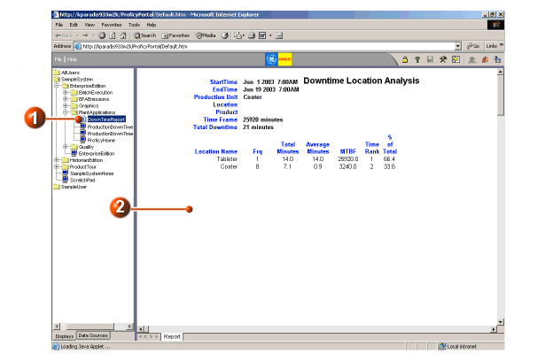
The DownTimeReport sample display is a web link to a Proficy Plant Application web report. Refer to the following illustration and legend for additional information.
|
|
Click here to access the DownTimeReport display. |
|
|
The Proficy web report appears in the display window. More |
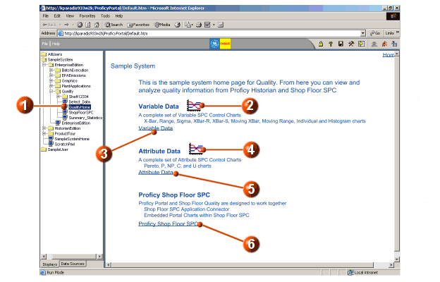
The QualityHome sample display provides a starting point for a sampling of displays that analyze variable data, attribute data, and for displays that use the VisualSPC connector to transfer data from Proficy ShopFloor SPC. Refer to the following illustration and legend for detailed information.
|
|
Click here to access the QualityHome sample display. |
|
|
Click here to access a pop-up XBar-R chart. This is a Thumbnail object that is configured with a variable-type data source. More |
|
|
Click here to access a display that features the use of variable data. See Summary_Statistics for more information on this display. |
|
|
Click here to access a pop-up Pareto chart. This is a Thumbnail object that is configure with an attribute-type data source. More |
|
|
Click here to access a display that features the use of attribute data. See Defect_Data for more information on this display. |
|
|
Click here to access the main ShopFloor SPC sample display. This is a starting point for a group of displays that feature the use of the VisualSPC connector. For more information, see ShopFloorSPC. |
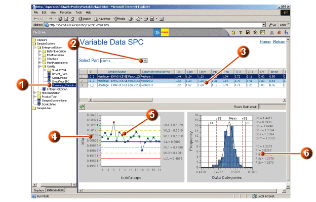
The Summary_Statistics sample display features the analysis of variable-type data.
The purpose of this display is to show the descriptive statistics for a selected part. Refer to the following illustration and legend for detailed information.
|
|
Click here to access the Summary_Statistics sample display. |
|
|
From the Select Part combo box, select a part. You will notice that several objects change when you select a part. The Select Part combo box is a manually entered list of variable part items (that is, it does not retrieve data from a data source). The Select Part combo box is linked to the grid by the Part Name filter. More |
|
|
A grid that retrieves data from the Summary Statistics data table and is filtered by the Part Name selected in the combo box. The characteristics for each part are shown in the grid. Click on a part characteristic – you will notice that the two charts below are updated. The FirstCellOfSelectedRow property of the grid is linked to the ID parameters of the two charts. More |
|
|
An XBar chart that plots the subgroups for each variable part characteristic. More |
|
|
Depending on the data you have selected (from the Part combo box and the summary statistics grid), you may see alarm markers in the XBar chart. The markers are set by default to be red squares. Place your cursor over the red marker and you will see, in red text, the name of the alarm test. For example, in the illustration, the point's alarm test is `4 or 5 in or beyond Zone B'. You can remove the subgroup from the chart by right-clicking the marker and selecting Exclude from the context menu. The marker now appears gray and the plotted line is redrawn. More |
|
|
A Histogram chart that plots the data distribution and shows calculated statistics for the selected variable part characteristic. The statistics on the Histogram chart are calculated directly from the subgroups (that is, they are not directly retrieved from ShopFloor SPC). More |
The Defect_Data sample display features the analysis of attribute-type data.
The purpose of this display is to show defect data for a selected Part. Refer to the following illustration and legend for detailed information.

|
|
Click here to access the Defect_Data sample display. |
|
|
Click a Part in the Part list. You will notice that several objects change when you select a part. The Part list box is a manually entered list of defect items (that is, it does not retrieve data from a data source). More |
|
|
Displays the Characteristic associated with the Part. The Part list box is linked to the Characteristic list box by the Part Name. The Characteristic list retrieves data from the Characteristics data table, based on the PartCharID column (the PartCharID column was selected in the Edit Source dialog box when the data source was set for the Characteristic list). More |
|
|
A Grid that shows the DefectName, DefectCount, and SubgroupDateTime for each part characteristic. The Characteristic list box's selected value (PartCharID) is linked to the PartCharID of the Grid. More |
|
|
A Pareto chart that plots the defect characteristic. The Characteristic list box's selected value (PartCharID) is linked to the PartCharID of the Pareto chart. More |
|
|
A C chart that plots the attribute characteristic. The Characteristic list box's selected value (PartCharID) is linked to the PartCharID of the Pareto chart. More |
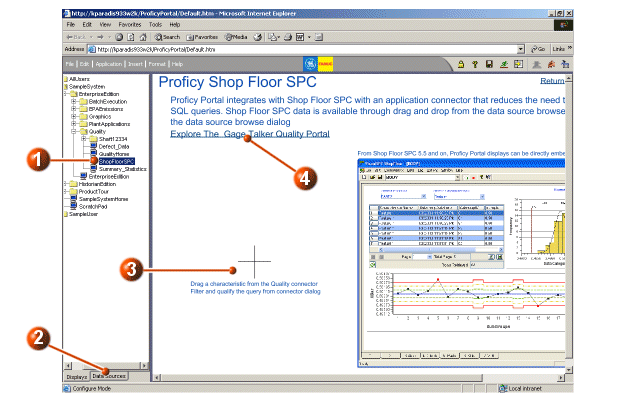
The ShopFloorSPC sample display features the integration of Proficy ShopFloor SPC with Proficy Portal via the VisualSPC connector.
The purpose of this display is to provide a demonstration of VisualSPC data source usage, as well as an example of how a Proficy Portal display may be embedded into the ShopFloor SPC workspace.
|
|
Click here to access the ShopFloorSPC sample display. |
|
|
Click the Data Sources tab. You will see a list of data sources. Expand the Quality folder and click the Data Tables node. More |
|
|
Click and drag the Characteristics data table onto the display. The Configure New Object dialog box is a wizard that will guide you through the insertion of an object, in this case, configured with data from the Characteristics table. More |
|
|
Click here to access the Home (Gage Talker Quality Portal) sample display. This display provides a starting point for a series of displays that illustrate VisualSPC data source usage in Proficy Portal. |
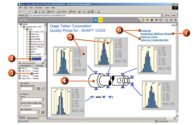
The Home (Gage Talker Quality Portal) is the main display for the fictional company, Gage Talker Corporation. The display, and its associated displays, provide a quality analysis of a specific part and its characteristics. The data is retrieved from the sample VisualSPC data source, to illustrate how ShopFloor SPC can integrate with Proficy Portal.
Refer to the following illustrations and legend for detailed information.
|
|
Click here to access the Home (Gage Talker Quality Portal) sample display. |
|
|
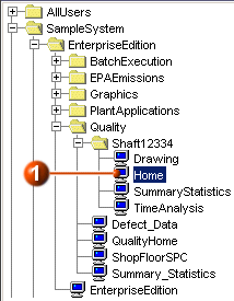
Click the Data Sources tab (as shown in the ShopFloorSPC sample display). Expand the Quality data source. Under the Parts node, you will see the shaft 12334 part. More |
|
|
Select the `shaft 12334' parts node to see each part characteristic. These part characteristics are used as data sources for the Histogram charts in the display. More |
|
|
An image of the shaft 12334 part. Shapes are also used to associate the part characteristic with its chart. |
|
|
There are five Histogram charts: one chart for each part characteristic. Each chart also shows the descriptive statistics for the part characteristic. More |
|
|
Click any of the links to view associated sample displays: |
|
|
Click the Inspection Method Sheet hyperlink to access a sample web page that shows the gaging frequency and gaging method for each part characteristic. |
The Drawing display is an example of an engineering drawing of the part and its characteristics, and is accessed from the Home display for the Gage Talker Corporation.
Refer to the following illustration and legend for detailed information.

|
|
Click here to access the Drawing sample display. |
|
|
The engineering drawing is inserted into the display as an Image object (.png file). More |
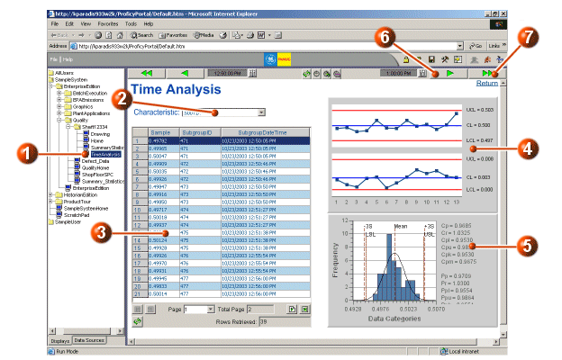
The TimeAnalysis display can be accessed from the system tree or from the Home display for the Gage Talker Corporation.
The purpose of this display is to allow you to scroll time forward or backward so that the sample/subgroup information and chart analysis update accordingly for the selected part characteristic. The same part data from the VisualSPC sample data source (shaft 12334) that is used in the Home display is used here.
|
|
Click here to access the TimeAnalysis sample display in the System Tree. |
|
|
Select a part characteristic from the Characteristic combo box. The combo box retrieves data from the Characteristics data table. The data source is set as follows (Edit Source dialog box):
The Characteristic value (PartCharID) is linked to the PartCharID of the grid, XBar-R chart, and Histogram chart. More |
|
|
A grid that shows the Sample, Subgroup ID, and SubgroupDateTime for the selected characteristic. The data source is configured with the By Date/Time option for subgroup selection. An absolute start and end time is defined for a 10 minute interval. More |
|
|
An XBar-R chart that plots the subgroup means and ranges. The data source is set in the same way as the grid. More |
|
|
A Histogram chart that plots the data distribution and shows the calculated statistics for the part characteristic. More |
|
|
Click the Scroll Time Forward button to scroll the time forward by 1 minute. The grid is updated with samples for that time period, and the charts are redrawn. The Scroll Time Backward button will likewise scroll the time backward by 1 minute. More |
|
|
Click the Scroll Time Forward Fast button to scroll the time forward by 15 minutes. The grid is updated with samples for that time period, and the charts are redrawn. The Scroll Time Backward Fast button will likewise scroll the time backward by 15 minutes. More |
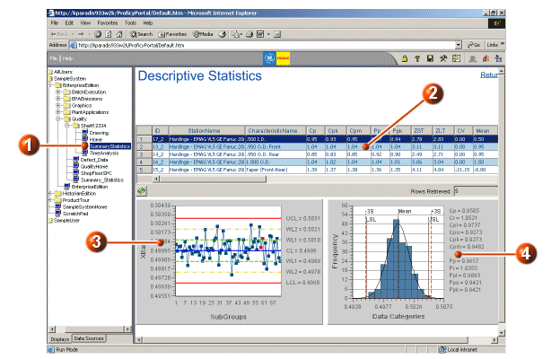
The Descriptive Statistics display can be accessed from the system tree or from the Home display for the Gage Talker Corporation.
The purpose of this display is to allow you to perform further analysis on each part characteristic for the `shaft 12334' part that is used as a data source throughout the Gage Talker Corporation sample displays. In this display you can select a specific part characteristic and view the analysis of the sample data in an XBar chart and a Histogram chart.
|
|
Click here to access the Descriptive Statistics sample display. |
|
|
A grid that retrieves data from the Summary Statistics data table. It displays descriptive statistics for each part characteristic. Click on a row in the grid – you will notice that the two charts below are updated. The FirstCellOfSelectedRow property of the grid is linked to the ID parameters of the two charts. More |
|
|
An XBar chart that plots the subgroups for each variable part characteristic. More |
|
|
A Histogram chart that plots the data distribution and shows calculated statistics for the selected variable part characteristic. The statistics on the Histogram chart are calculated directly from the subgroups (that is, they are not directly retrieved from ShopFloor SPC). More |